A control chart plots a process characteristic over time against statistically calculated control limits, separating routine common-cause variation from special-cause signals that require action. Chart choice depends on data type: X̄-R or X̄-S for variable data in subgroups, I-MR for individual readings, and p/np/c/u charts for attribute (count) data.
What a Control Chart Actually Tells You
Every process varies. The question that matters is what kind of variation you're seeing. Common-cause variation is the routine noise of a stable process — adjusting the machine in response to it ("tampering") actually makes output worse. Special-cause variation signals something changed: a tool wearing, a new material lot, a drifting fixture. Control limits — calculated from the process's own data at roughly ±3 standard deviations — draw the statistical line between the two, so operators react to signals and leave noise alone.
Control limits are not specification limits. Specs describe what the customer will accept; control limits describe what the process is actually doing. A process can be comfortably inside spec while drifting out of control — and that drift is your early warning, hours or days before defects appear.
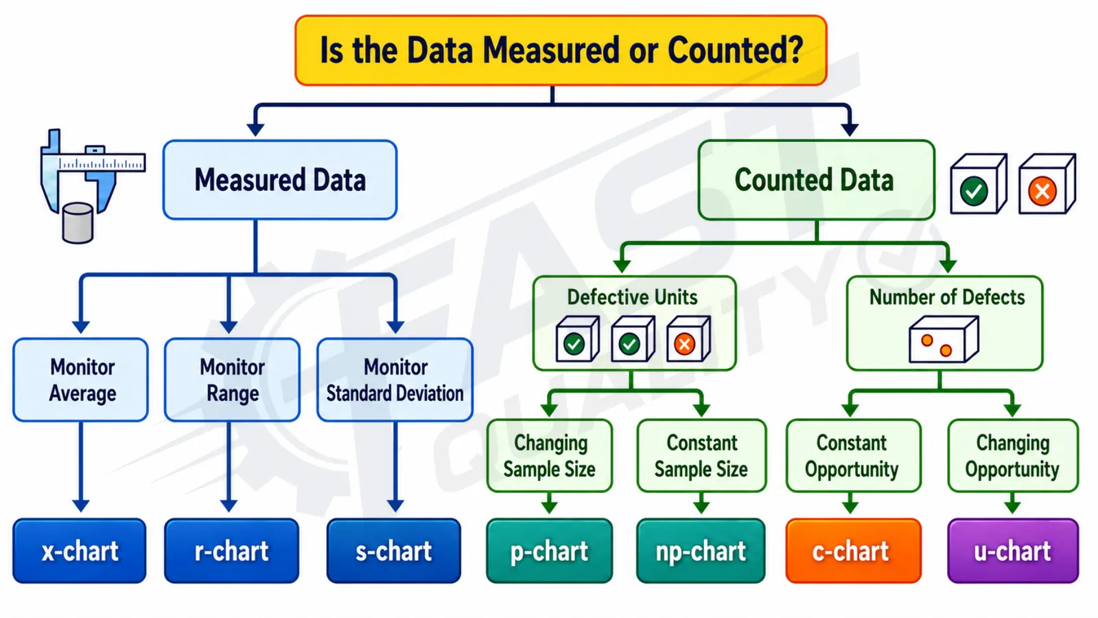
Chart Types and How to Choose
| Chart | Data type | Use when |
|---|---|---|
| X̄-R | Variable (measured) | Subgroups of 2–9 consecutive parts per sample — the workhorse for machining and molding dimensions |
| X̄-S | Variable | Subgroups of 10+ where the standard deviation beats the range as a spread estimate |
| I-MR | Variable, individuals | One reading per period — batch processes, chemistry values, destructive tests |
| p / np | Attribute (defectives) | Fraction (p) or count (np) of defective units per sample; p handles varying sample size |
| c / u | Attribute (defects) | Defects per unit of product — c for constant inspection unit, u for varying |
Decision shortcut: measured value → how many per sample? (1 → I-MR; 2–9 → X̄-R; 10+ → X̄-S). Counting bad units → p/np. Counting flaws per unit → c/u.
Reading the Chart: Out-of-Control Rules
A point beyond a control limit is the obvious signal, but patterns matter as much (the Western Electric rules capture the common ones):
- 1 point beyond ±3σ (Zone A boundary)
- 2 of 3 consecutive points beyond ±2σ on the same side
- 4 of 5 consecutive points beyond ±1σ on the same side
- 8+ consecutive points on one side of the centerline — a shift
- 6+ points steadily rising or falling — a trend (classic tool wear)
Every signal needs a defined reaction plan: who stops what, who investigates, what gets quarantined. A chart without a reaction plan is decoration — this is also what IATF 16949 auditors check first.
Control vs Capability: Cp and Cpk
Control asks: is the process stable and predictable? Capability asks: is that stable process good enough for the spec? Cp compares spec width to process spread; Cpk also accounts for centering. A common automotive expectation is Cpk ≥ 1.67 at initial approval and ≥ 1.33 ongoing — but capability math is only meaningful after the chart shows statistical control. Computing Cpk on an unstable process produces a number that predicts nothing.
Making SPC Work on a Real Shop Floor
- Chart what matters. Start with special characteristics from the PFMEA and control plan — not every dimension on the drawing.
- Kill manual transcription. Readings should flow from the instrument into the chart automatically — direct Mitutoyo/Mahr/Keyence integration removes both effort and transcription error.
- Alert the person who can act. A signal at 2 a.m. must reach the shift supervisor immediately, not appear in a morning report.
- Trust the measurement first. If the gauge fails its Gage R&R study, the chart is plotting measurement noise, not the process.
- Review and act on capability trends — feeding chronic low-Cpk characteristics into improvement projects instead of tolerating scrap.
Modern SPC software does the statistics, chart selection and alerting automatically — operators see simple pass/act signals while quality engineers get capability analytics and long-term trends across every station.

Dhanashree Kathare
Co-Founder, FAST Technology — writes about practical quality engineering for manufacturing teams.
Connect on LinkedIn